Financial Advisors
 Money Bloggers
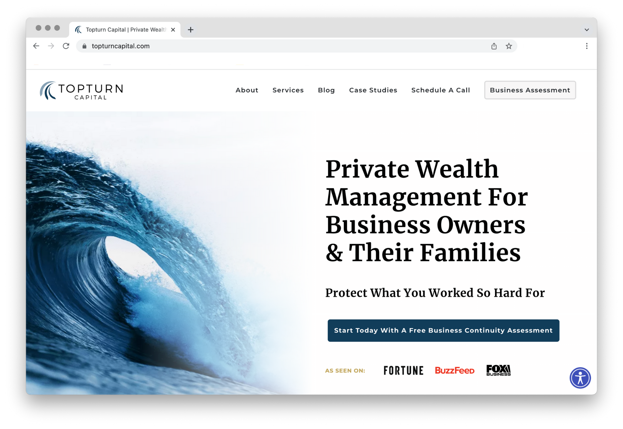
Your website is an essential part of marketing yourself as a financial advisor online.
Many Financial Advisors come to us because they know they have something unique to offer. They just don’t know how to convey their value.
Even the most beautifully designed site is worth little if it doesn’t portray the benefits you can provide to your clients and convince those ideal prospects to start a conversation with you.
In this case study, we want to show you how we transformed Topturn Capital’s website into something that represents their firm, looks good and gets results.
Struggles
- After many years in the business, they wanted a fresh take on the brand.
- They felt the story behind their brand wasn’t clear.
- Their website didn’t target their client base (small business owners).
- They felt their site didn’t reflect the firm’s authority and what they’ve achieved for their clients.
Goals
- Position the firm for the future and set them up to grow beyond the founding members.
- Clarify their message and whom they serve.
- Prepare the site for an upcoming book launch.
Transformation
Whenever we design a website, it is vital to grasp the very essence of our client’s firm. To create a website that attracts and converts the right clientele, we consider three aspects:
- A brand story and message that speaks to the firm’s ideal client’s pain points and desires.
- A web design and development (or “character”) that reflects the firm’s culture and makes it easy for visitors to navigate the site.
- An effective conversion strategy tied into the design and branding and, if done correctly, converts qualified leads.
Below you will see the process we took our clients, Greg and Dan from Topturn Capital, through to create a website that equals their expectations and goals. This process conveys their firm’s value and authority on their website.
Brand Story & Message
To craft a unique brand story & message, we need to understand what our clients excel at and how to position them as the authority in the financial advisor market. We did this in two steps:
DeeperDive™
During the DeeperDive™, our experts interviewed Greg and Dan to learn about their unique perspectives, personalities, and values, what they do for their clients, their vision, and goals for the firm.
Clone-A-Client™
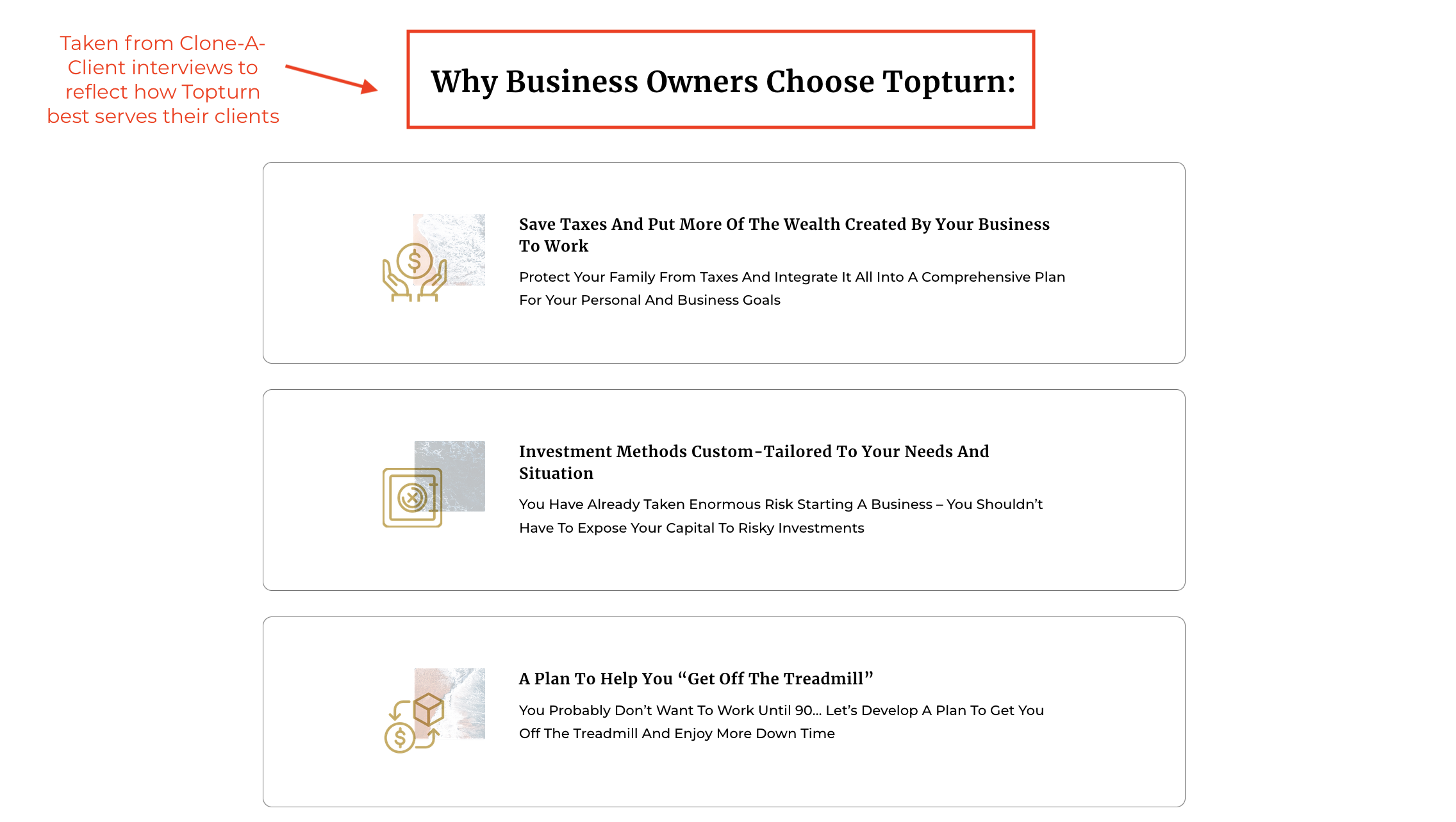
To understand their business better, we performed Clone-a-Client™ interviews, which we do for all our projects. By interviewing Topturn clients, we learned about why they started working with the firm, why they continue to work with them, and what their experience with the firm has been.
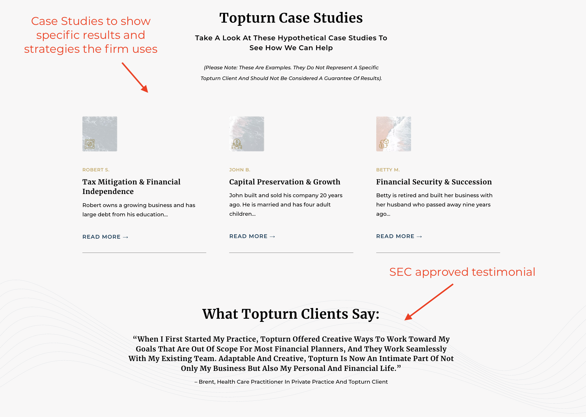
The interviews with Topturn’s clients allowed us to take advantage of SEC’s new laws regarding testimonials. We added three testimonials to the website that we took directly from our interviews with their clients. These testimonials were reviewed and approved by Topturn’s compliance officer.
This research phase allowed us to craft a custom-tailored brand story and message that bridged the gap between what Topturn does and what their ideal clients are looking for most.
Now that the direction and focus of the site are clear, it’s time to get into the design phase.
Web Design & Development
The design of a site is as important as a restaurant’s inventory. It gives a specific vibe, attracting a particular tribe. Therefore, it’s essential to match the design with the prospective client base, reflecting their values and positioning the firm as the expert.
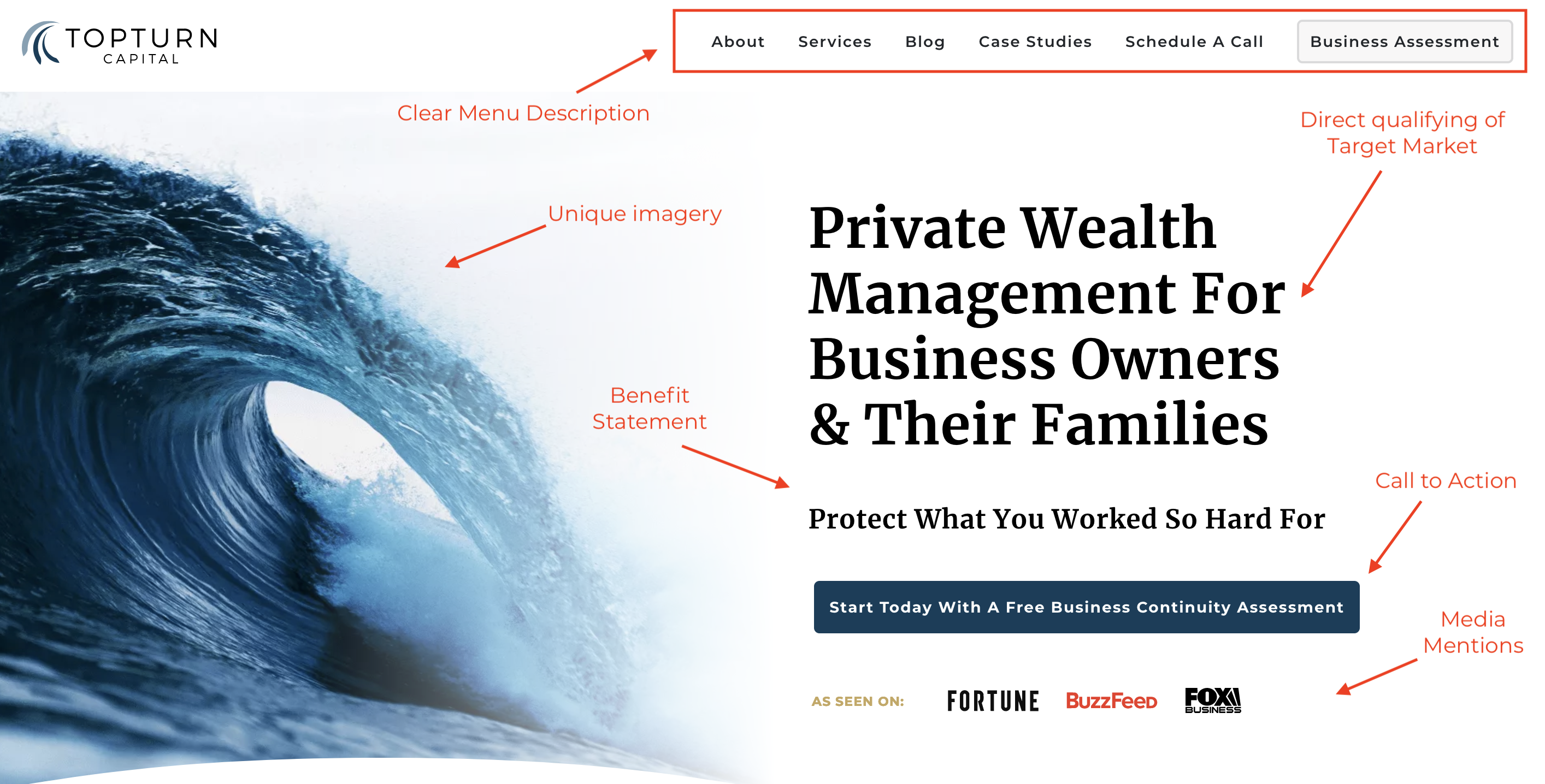
Above the Fold
The “Above the Fold” is the first impression of any website and, therefore, a vital part of how you market yourself as a financial advisor: every element and placement matters in how visitors perceive it.
Below are the essential “authority triggers” that we included in Topturn’s new design to reinforce and validate their authority on the website, one of their main goals when coming to us.
- Qualifying Title
- Displaying who a website is for in the title allows people to know if they’re in the right place immediately.
- Benefit Statement
- It tells visitors what they can expect when working with Topturn.
- Media Mentions
- Serves to position the firm as an expert
- Clear Call to Action
- CTA’s are crucial to making any site convert.
- Unique Imagery
- An image says a thousand words. Topturn named its firm after the analogy of a surfer’s complex process to forego a turn at the top of a wave, which relates to successfully managing finances for small businesses.
- Clear Menu Description
- A confused mind doesn’t try to figure it out, but leaves. Make it easy for visitors to find the information they are looking for by keeping the site’s structure simple.
Before
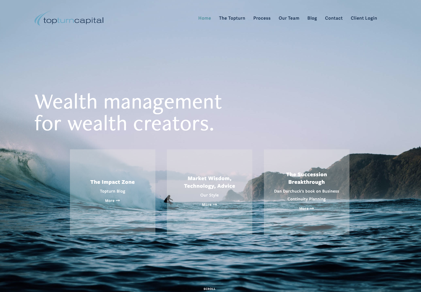
After
Homepage
The homepage should give visitors a snippet of the website’s contents and a good reason to continue reading, then guide them towards the following steps.
We have learned through analytics and experience that most people don’t read through detailed information on a website they visit for the first time.
Rather, these first-time visitors scan the page for what they are looking for, leaving if they can’t easily find it.
So instead of filling the homepage with text and images that don’t have a specific purpose, we included the following things on Topturn’s homepage to retain visitors’ attention:
- Easy display of Topturn’s best content
- SEC approved testimonials to strengthen their credibility
- Short description of the value Topturn provides to their clients
Before
After
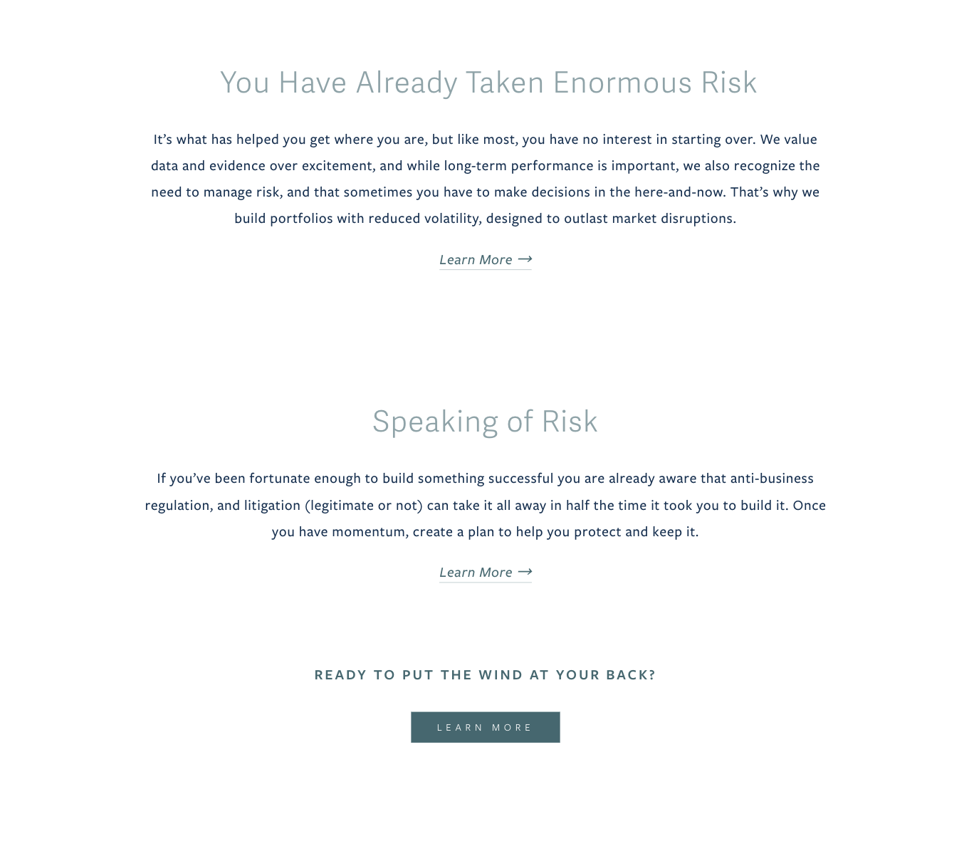
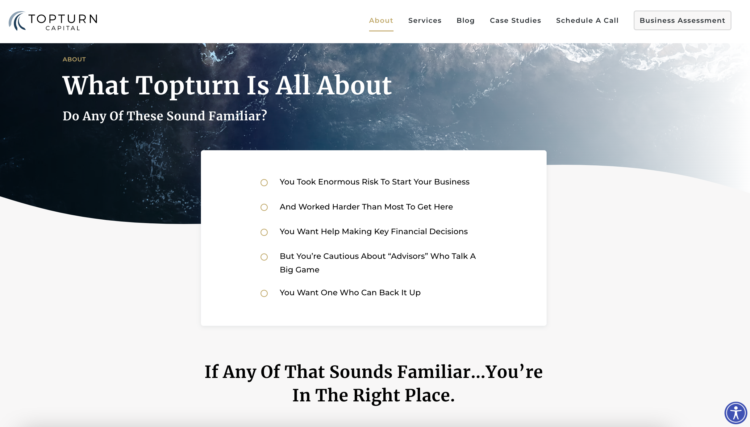
Upside-Down About Page
According to analytics, we have found that 80-90% of people who book a discovery call, visit the about page first. Therefore, it is a vital part of your website. You probably think that people come here to learn more about your business. Instead, visitors click on the about page to find relevant information about what you can do for them.
For this reason, our strategy is to start talking about prospects’ needs first, assuring that the firm understands the visitor’s pain points and knows how to solve them.
Read more about the Upside-Down About Page Strategy.
Are you tired of looking like any other advisor?
Find out how we can transform your website into a business asset through
Web Design & Development.
Conversion Strategy
Now that we have created a site that speaks to ideal clientele, it is time to make it easy for ideal prospects to take the next step and become a lead. There are two ways to convert traffic into leads:
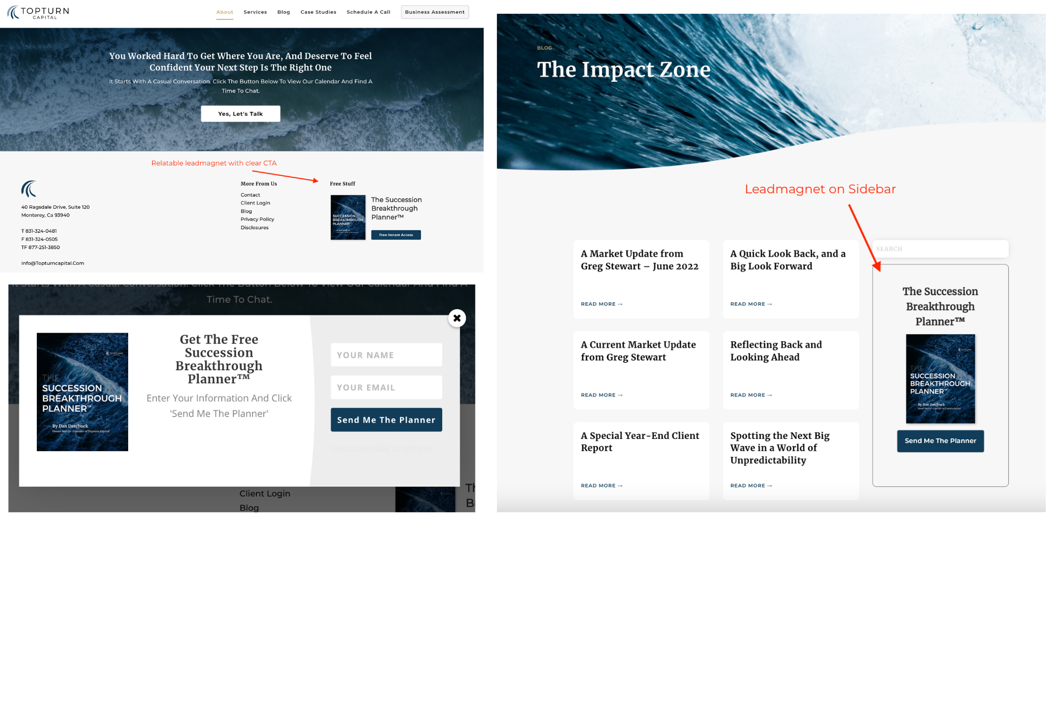
1. Create An Irresistible Lead Magnet
Lead magnets capture emails of prospects who aren’t yet ready to schedule a call.
The digital freebie you offer should solve your ideal client’s most pressing needs.
It is essential here that the resource you provide is not only informational but transformational, enforcing your authority and the perception of how you can help those on the fence reach their goals.
For Topturn, this was a Succession Breakthrough Planner™ PDF (relevant to the clients they want more of).
It’s placed all over the site, e.g., on the about page and the blog page. When someone clicks the CTA button, a pop-up appears to quickly put in a name and email address.
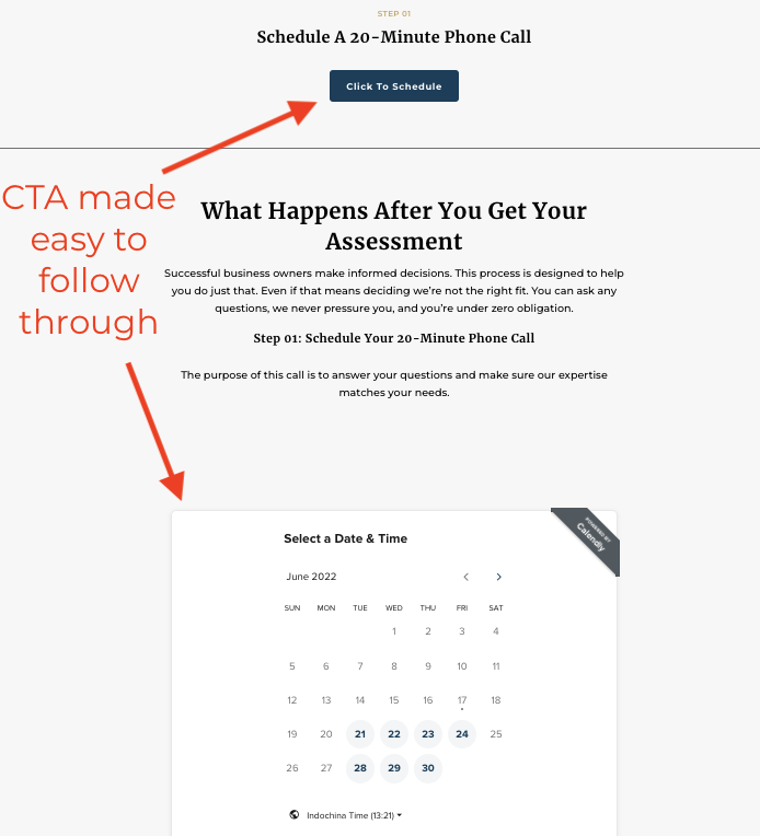
2. Provide A Unique Discovery Process™
Your ultimate goal with your website is to get those discovery calls scheduled. Having your contact information listed on your site is not merely enough.
The most effective way to get leads knocking on your door is by giving them clear instructions on the next steps, transparency of what they can expect, and an instant benefit to justify following those CTA’s.
The Unique Discovery Process™ does all that, and it’s something to call your own. It improves your credibility, authority, and trustworthiness, therefore leveraging your financial advisor marketing efforts.
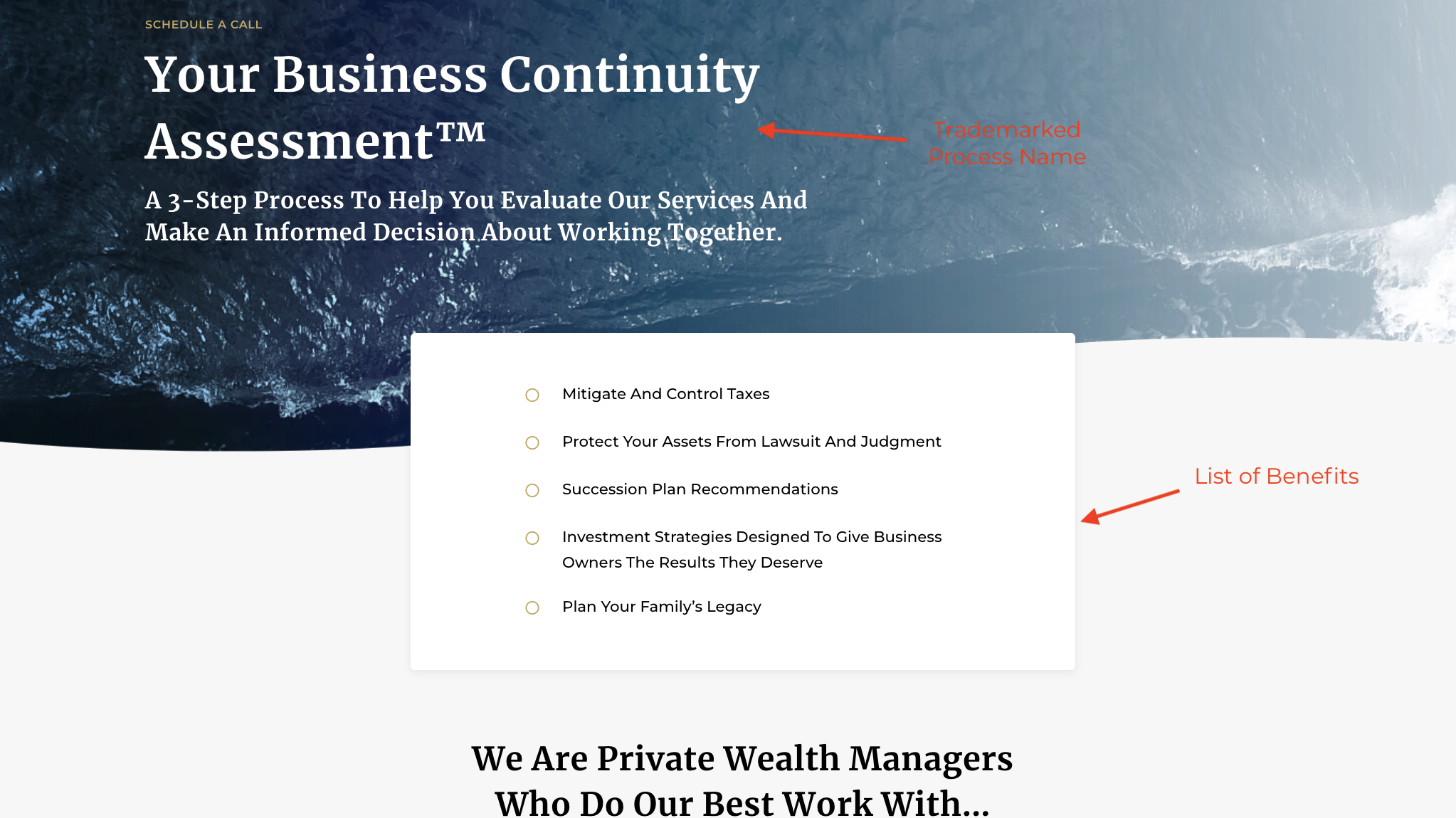
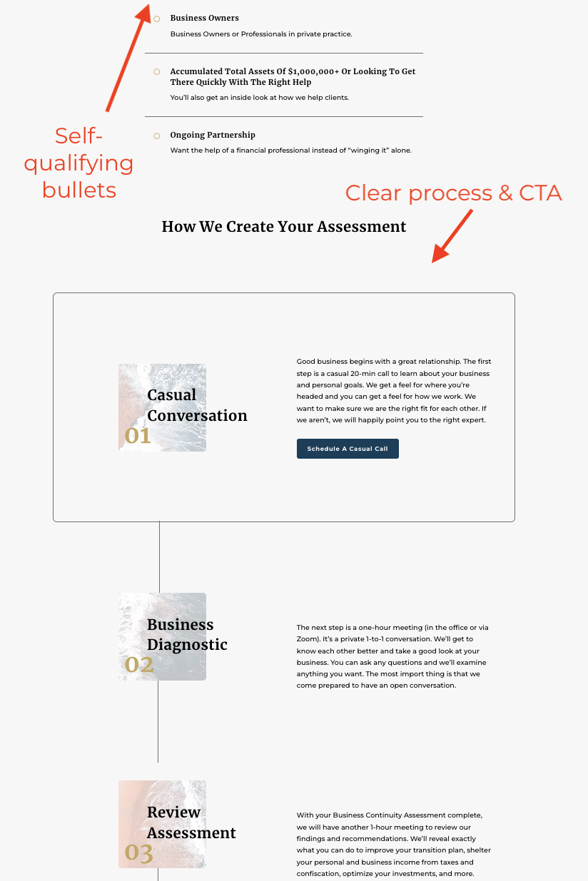
We worked with Topturn to craft their UDP™, “the Business Continuity Assessment.”
Instead of a “discovery call,” prospects can now sign-up for a 3-step-process in which Topturn assesses their business financials. This way, Topturn can identify opportunities to reduce taxes and accelerate savings for the prospects.
Topturn’s conversion strategy went from a simple incentive to schedule a call to a trademarked process:
Before
After
Learn how we can help you create a conversion strategy for your advisory business.
Conclusion
Most financial advisors have a website, they know it is a must to market themselves in today’s digital world.
But few advisors know what they can get from their website, let alone how to create a website that supports their marketing efforts and converts prospective clients.
Your website’s primary goal is to validate and convey the value you give to your clients and ensure prospects know that you can solve their problems.
Crafting a brand message and design that reflects your firm’s core at its best and then implementing some of the key elements mentioned in this case study on your site will help you transform a boring advisory website into an authoritative expert’s hub.
Since Topturn’s re-design, the firm has received outstanding feedback from prospects who turned to clients after visiting their website:
“When a referred couple looked at our website, pondering whether to come with us or not, they called me back and said, “Yeah, we spent some time on your website, and all we can say is, we wish we’d met you 20 years ago” – Dan Darchuck