You want to attract your ideal clients and convert them into customers, right? Then your financial advisor website design needs to rock!
Having a great financial advisor website design is one of the top digital marketing strategies to market yourself as a financial advisor.
It’s not just about having a good-looking website but one that looks appealing to your ideal clients.
There are several vital elements every website design should include to look attractive and draw the user’s attention.
We’re going to look at three essential aspects that can make or break the design of a financial advisor website.
Above The Fold
Just like the entrance hall of a house, the top portion of your home page is prime real estate and an ample opportunity to earn the trust of your visitors.
Your above-the-fold will determine whether the user dives deeper into your website or leaves altogether.
It’s not only about being visually attractive but about your financial advisor’s website design being able to communicate YOUR brand to your ideal clients.
If they know you can help them, they will stay.
There are three things to include on your Above the Fold that will make users want to know more:
- A clear call to action (CTA)
- Dynamic background
- Negative space
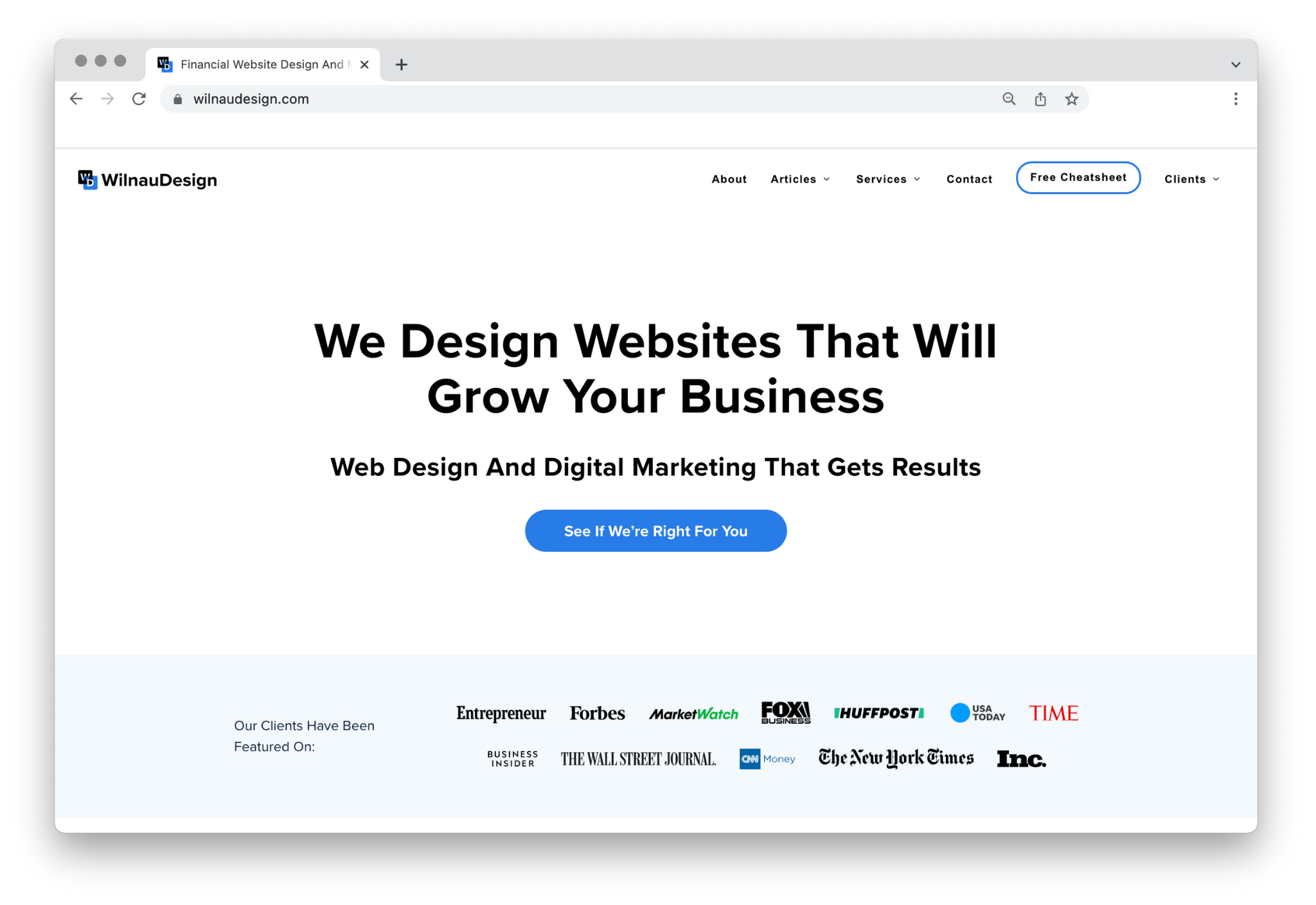
The headline in Todd Tresidder’s financial advisor website design is clear and compelling, while the conversion path stands out.
There’s also a great use of contrast and positioning.

Use contrast and positioning to create an effective Above-the-Fold
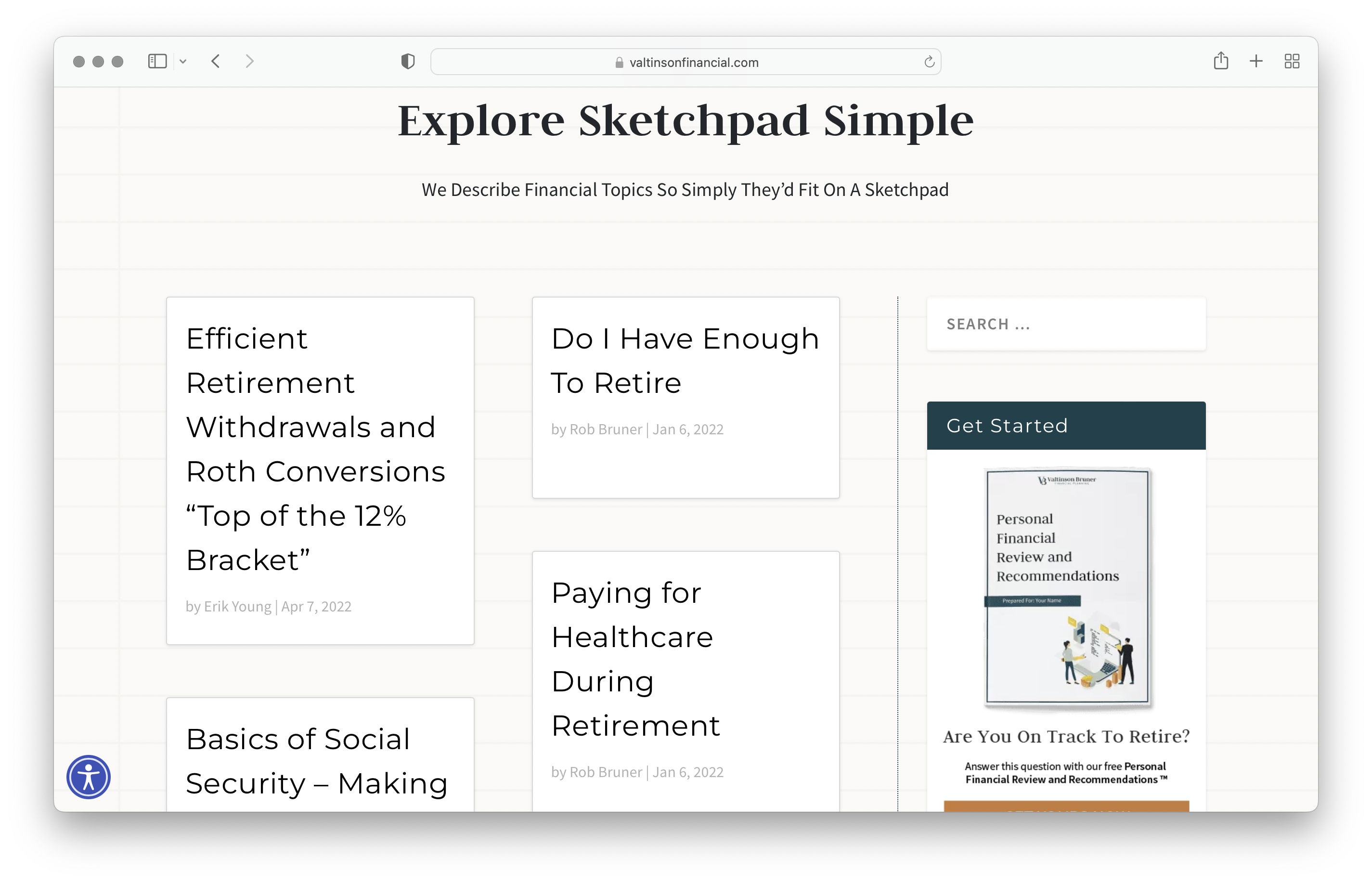
We might be a bit biased, but below is an excellent example of embracing negative space by limiting the use of copy and visuals:
Make essential information stand out by using whitespace effectively
Not sure how to do this? Let us take a look. Schedule a 20’ call with us.
Don’t Make Prospects Wonder
“Design is not just what it looks like and feels like. Design is how it works.” -Steve Jobs.
People who visit financial advisor websites seek answers to their questions and solutions to their problems. That means specific information.
They don’t like figuring out how things work or where to find what they are looking for.
Since a user’s motivation is to save time, your financial advisor website design should make its navigation self-evident.
Here are a couple of things that will ensure a smooth experience for the visitor:
- Keep things simple
- Intuitive navigation
- Mobile friendly
Consistent and clean fonts make the content more scannable, especially if your website includes a blog with different topics.
Organize your blog using clean and consistent fonts
The navigation header makes it easy to find what they’re looking for. While highlighting the active state, let readers know which page they are on.

Highlight the active state to provide readers with easy navigation.
The website displays beautifully on all devices and doesn’t hinder user engagement.
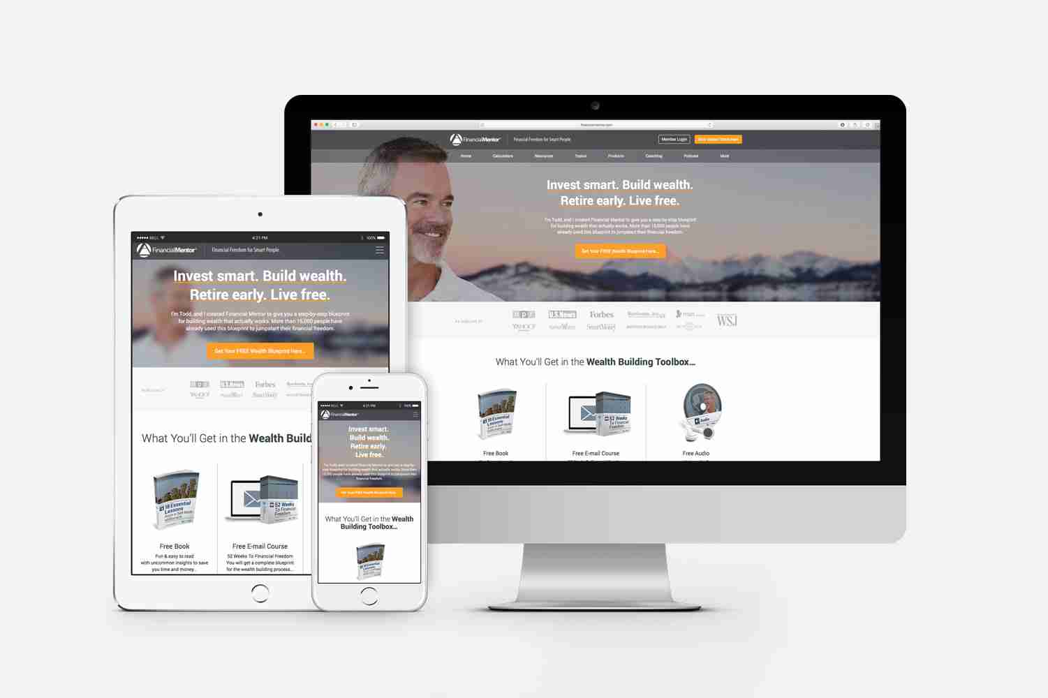
Make sure your site displays correctly on all devices
Let’s do users a favor and give them an experience that’s easy to navigate and mobile responsive.
If a visitor leaves frustrated because they are on a mobile device and your site isn’t optimized, it’s unlikely they will return.
Learn more about this on our free cheatsheet with 3 ways to market yourself as a financial advisor.
Appearance And Visual Communication
A well-designed financial advisor website builds trust and delivers value. Let’s focus on three main areas that add to that beautiful coat of paint:
- Select a limited set of colors and tones.
- Use graphics that support content.
- Display custom imagery or background videos.
The combination of muted purple tones and several bright colors creates a nice contrast.

Create contrast by combining different tones and colors.
The graphics support the context and elevate its meaning.
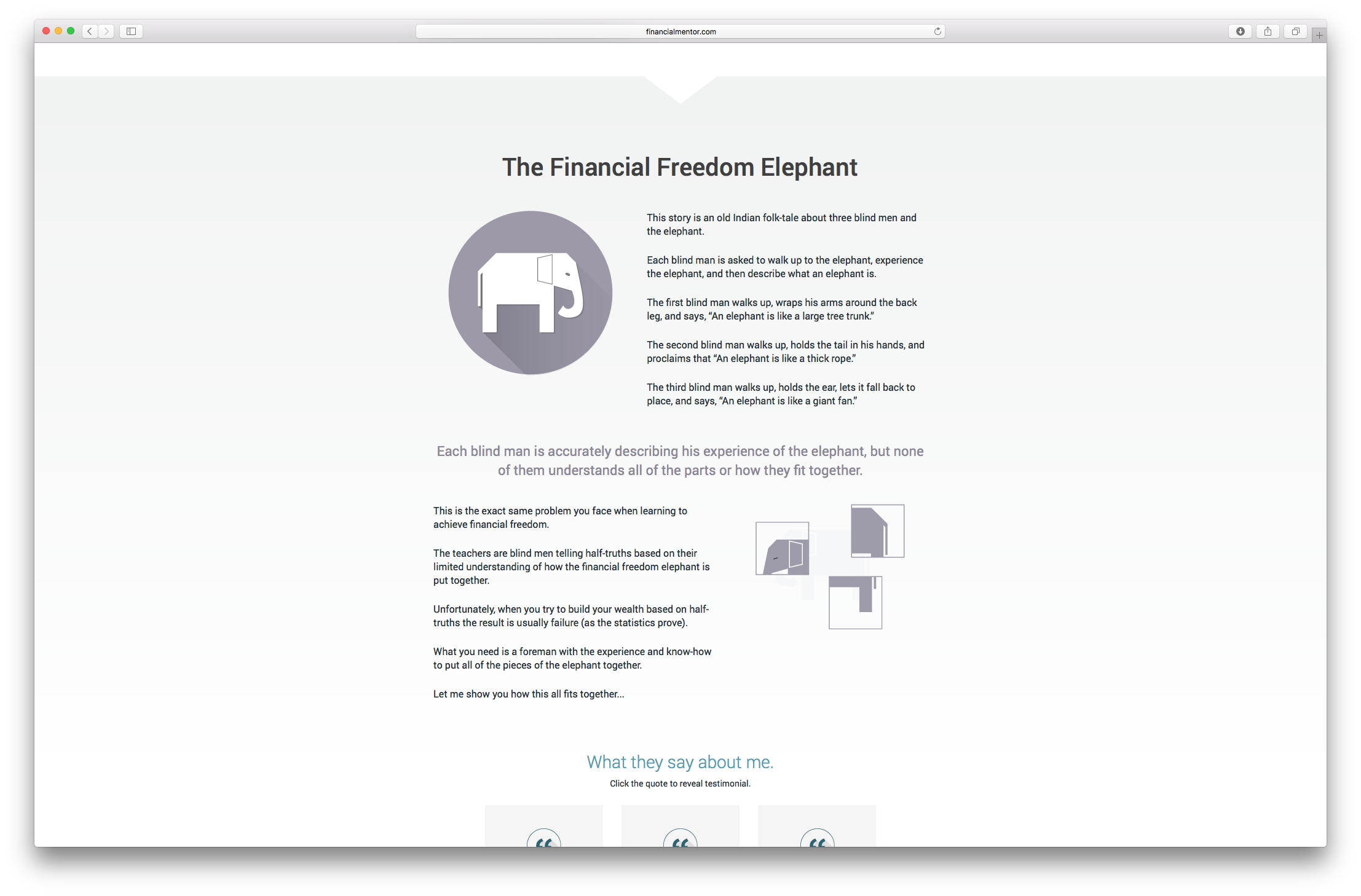
Support context by using graphics that elevate it’s meaning.
The custom video background captures attention and adds excitement.
Watch this video to see a financial website design background example:
To keep the user from hitting the back button after landing on your website, it’s essential to use the right color palette, supporting graphics, and custom imagery.
Wow them with your good looks! You don’t get a second chance to make a first impression. That’s the primary goal of a great financial advisor website design.
Find out more about effective blog design here.
Remember…
Your website is a direct reflection of you and your business.
Make sure it looks professional, and you’ll make a great first impression!
Is your website dressed to impress?
If your answer is no, and you are seeking help to create a website that truly reflects your business and values, check out our Website Design and Development Package to learn more about how we can help you achieve your goals.